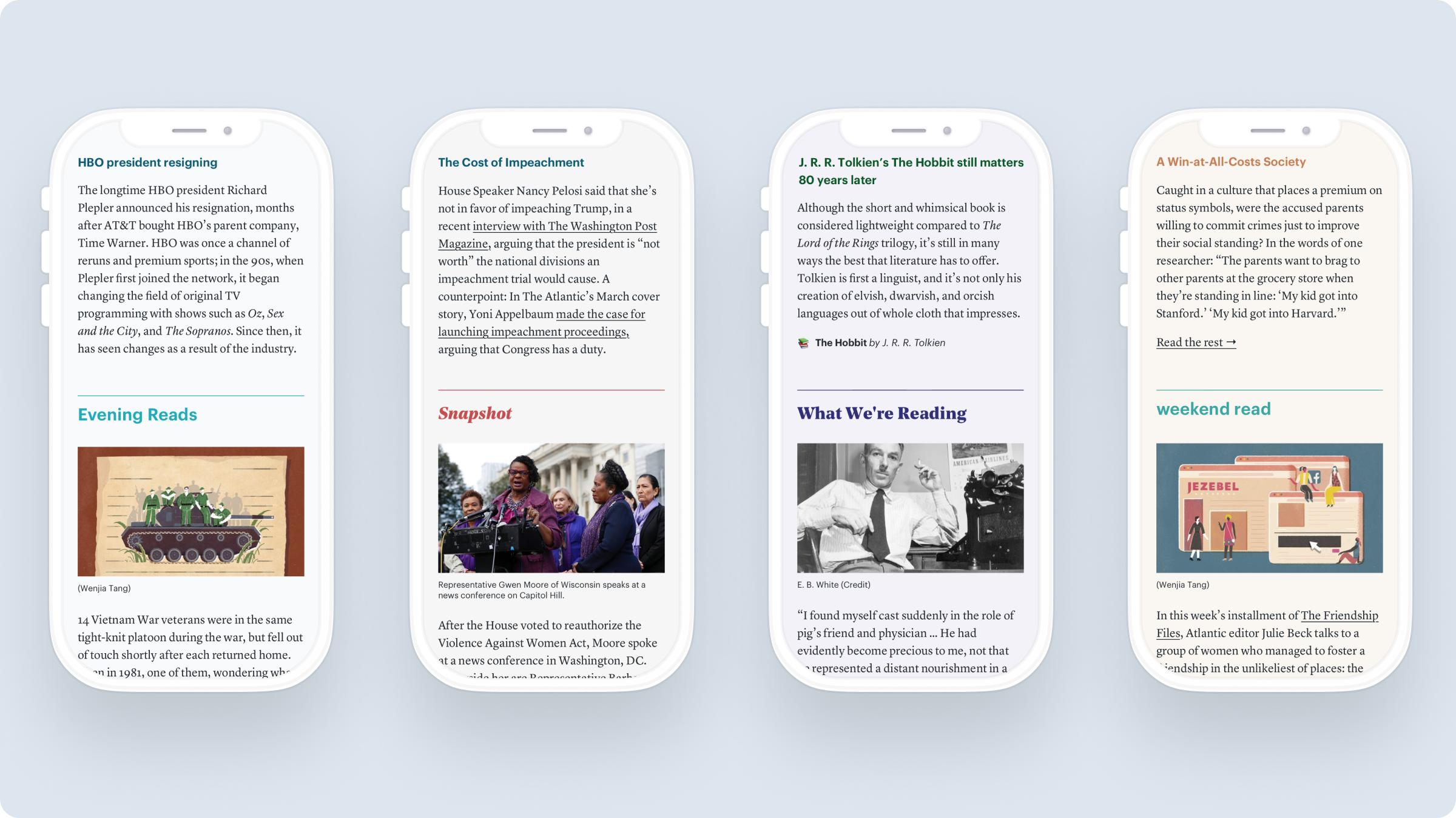
I designed a modular newsletter suite for The Atlantic’s newsletters, which launched with the redesign of the flagship The Atlantic Daily. I also wrote a Medium post about how the process went.

The newsletters infrastructure was showing it’s age. Originally built with limited styling, the newsroom needed a richer editorial toolkit to spin up various newsletter formats, and we wanted a more flexible backend to evolve newsletters as a standalone editorial product.
I surveyed designs from a variety of other popular media newsletters: NYTimes The Daily, The Skimm, Morning Brew, Quartz Weekly Obsession, Medium Tech Brief, etc,
I also interviewed editors to understand newsroom needs and came up with a list of formats to support: photo essays, interviews, excerpts, timelines, news roundups, feature stories... the list goes on and on.
I designed multiple iterations of various components, focusing on various heading styles and combinations, quote sections, images, and author bylines. Through multiple reviews with editorial and product/engineering stakeholders, a range of components and selected heading 1-4 styles were refined.
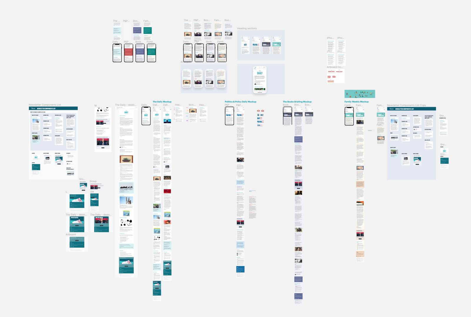
Explorations for various newsletters
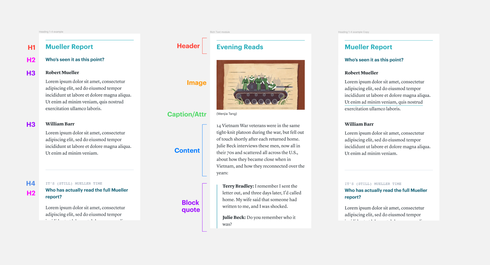
Breakdown of modules in use
The timing of our newsletter suite redesign coincided with an ambitious overhaul of our flagship newsletter, The Atlantic Daily. Using the styled components, I created a layout that gave the newsletter an airier, more modern look, as well as highlighting it as a platform to provide context on the big stories of the day, feature the range of our coverage, and resurface gems from our archives.
A prototype of the design can be viewed here. The various header components, sponsor tags, quotes, section dividers, accent sections, house promos, and a streamlined footer created an easier to digest newsletter, and a survey of readers said they found the new version “more lively” and cleaner, compared to the old newsletter, which was “daunting” to read.
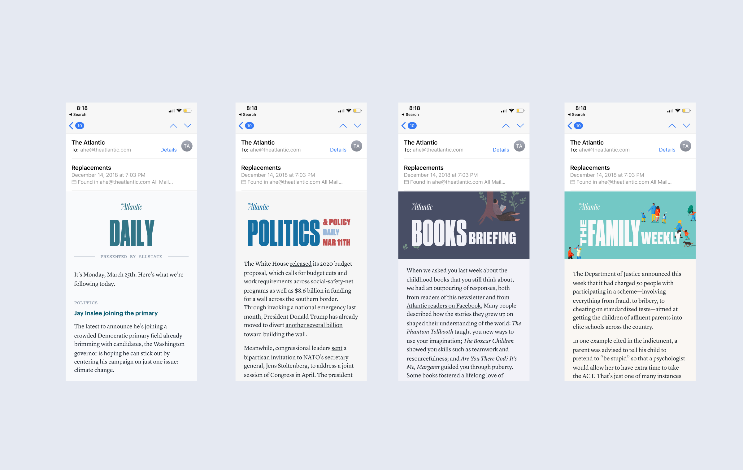
Stylizing our existing newsletters

Themeing with different heading styles and colors
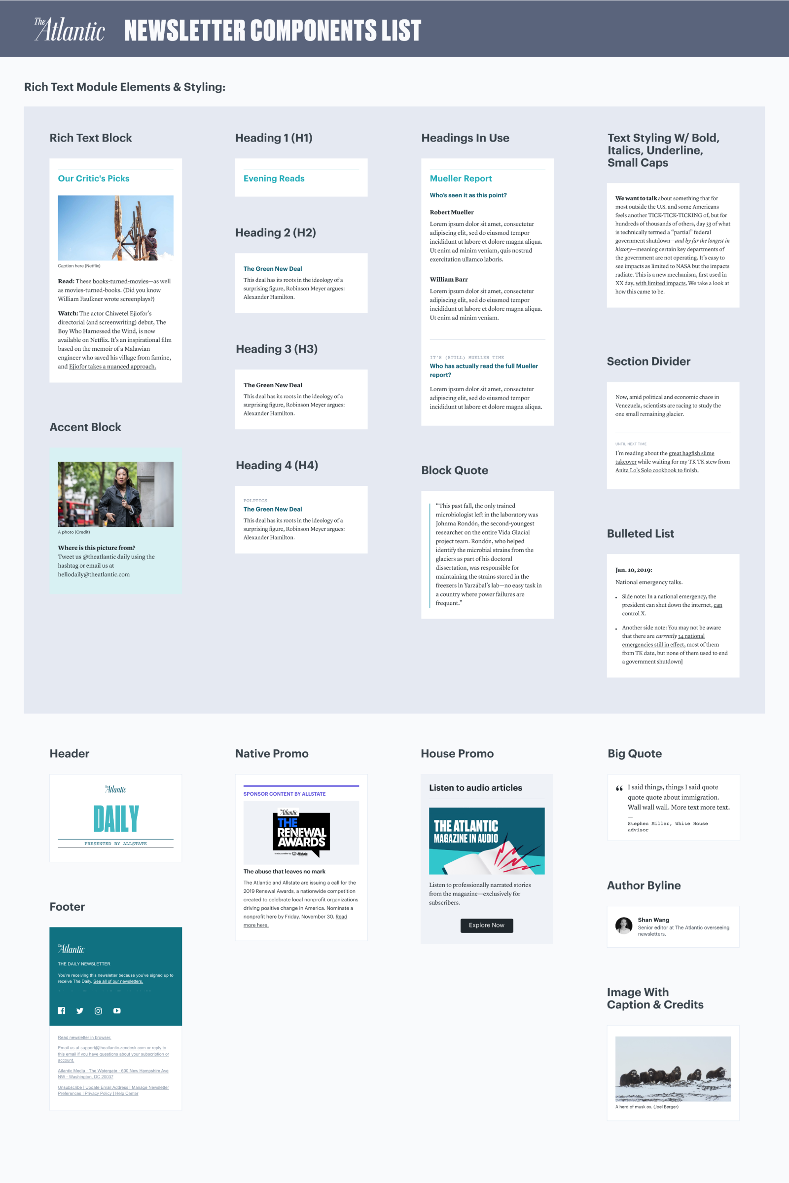
As a firm advocate for thorough documentation, I created a few artifacts to document the newsletter suite, including a component list and a styleguide for editorial. This documentation will result in fewer inconsistencies and allow future newsletter to be spun up following these guidelines, as well as serve as a place to note any future changes and improvements as The Atlantic’s newsletters grow.
After I left my role at The Atlantic, various newsletters have been built or relaunched with these newsletter components. The Atlantic Daily refreshed their brand following the entire magazine redesign, and the components held up to this redesign. Weekly Planet also launched using the newsletter suite. Always rewarding as a designer to see your work live on afterwards.