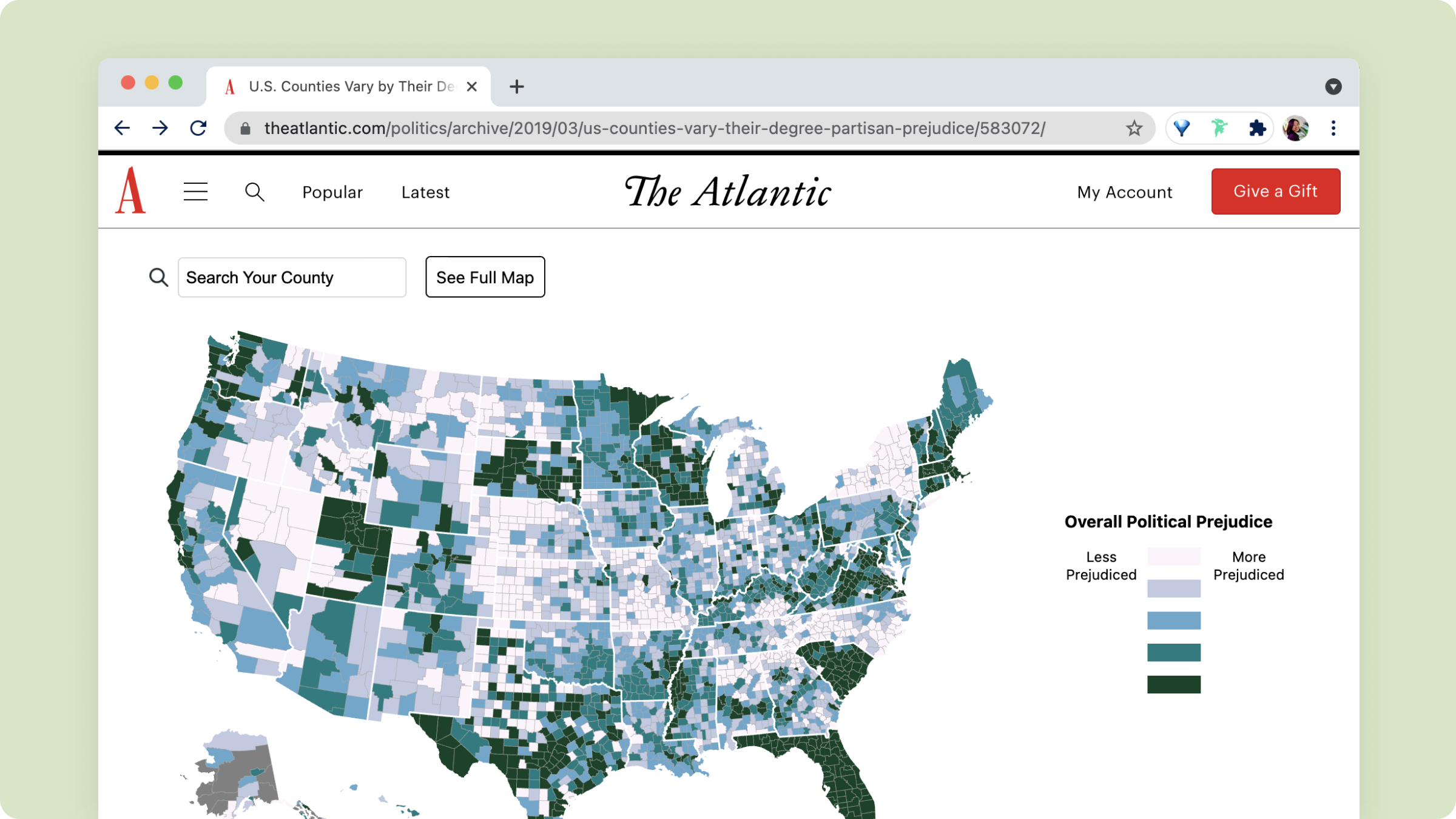
I collaborated with front-end developer Rekha Tenjarla to create three interactive map visualizations that allow readers to look up how politically partisan their home county is.
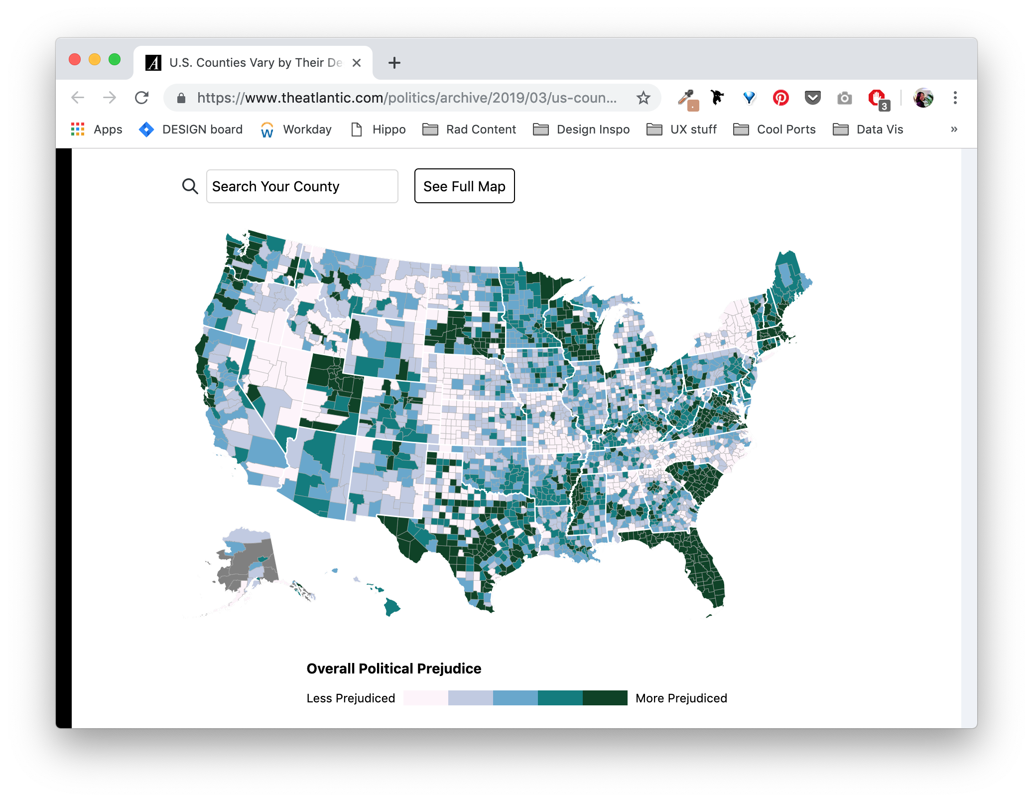
For an Atlantic piece on political intolerance, we were given data for how politically partisan each county in the U.S. ranked. In some places, Americans are quicker to dislike or stereotype those who hold different political views, while other places are more accepting of others despite disagreements. Using this data, we created interactive d3.js maps to accompany the article. The final maps looked like this:
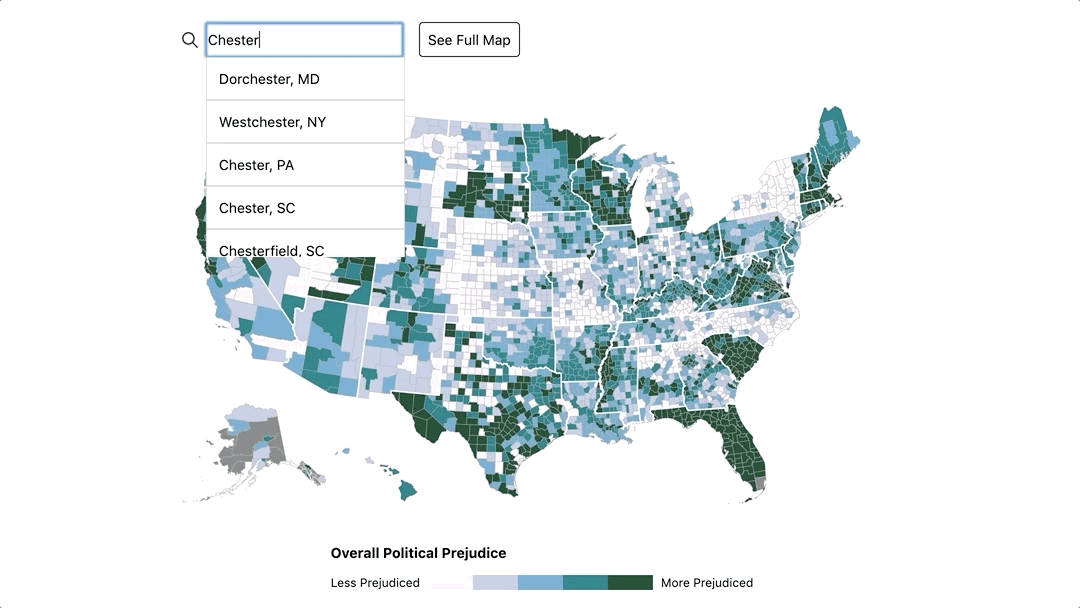
Searching a county
Legend: numerical scores didn't convey much information to the reader, so simpler language and a horizontal legend (optimized for mobile/desktop) were used.
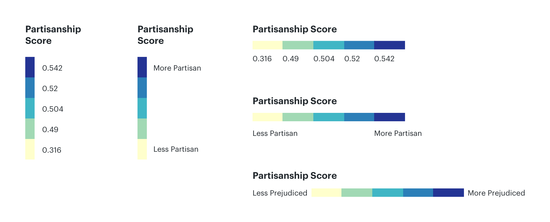
Legend layouts
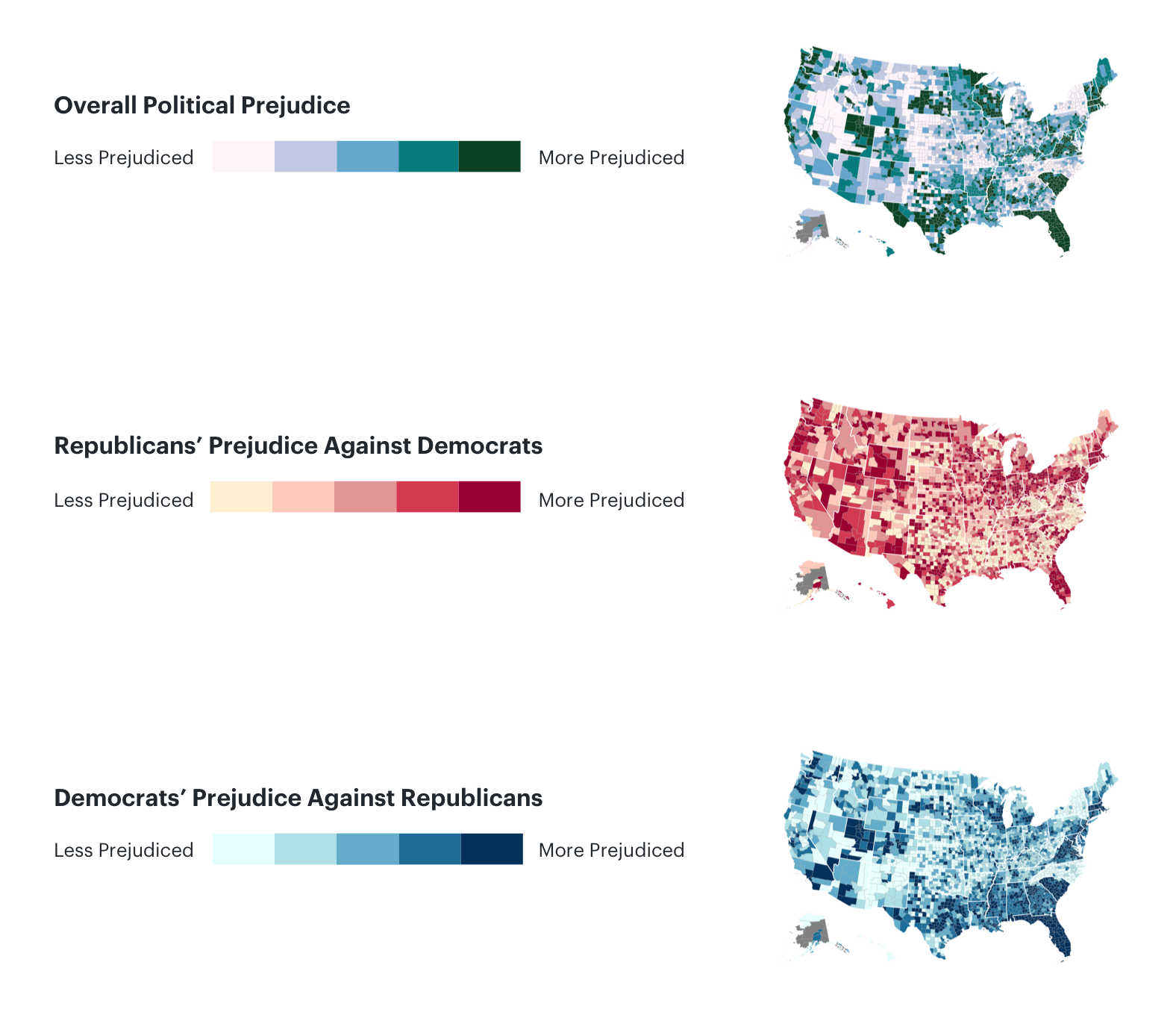
Color schemes for the three maps
Explore the maps here! Look up your home county to see how politically prejudiced it's ranked and read about the data findings in the article.
...there were map cupcakes (mapcakes!) to celebrate the launch, courtesy of our lovely product manager, Anika.