I led the redesign of the solar dashboard — from defining problems, scoping work, ideating design, planning and conducting user research, and partnering with engineers to polish the final product.
The team consisted of a lead designer (me), a product manager, an engineering manager, a user researcher, and five engineers.
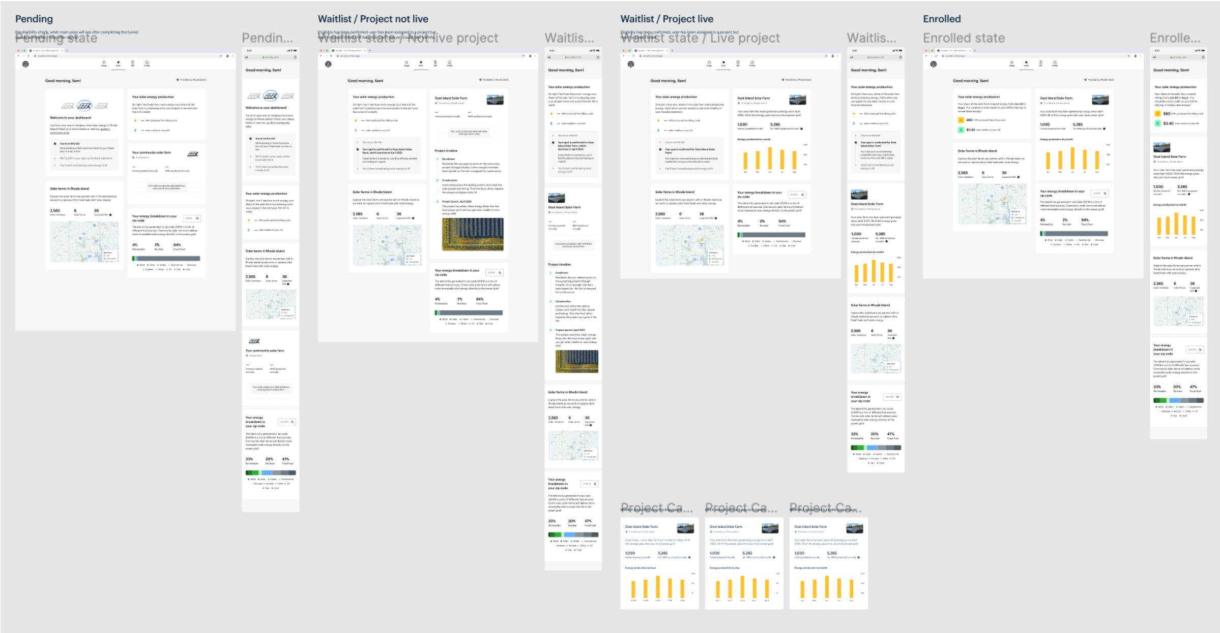
Community solar is a program for customers to redirect their energy bill towards a remote solar farm in exchange for monthly savings. The existing solar dashboard lacked information and didn't clarify the steps to being fully enrolled on a farm.
As a result, customers were cancelling due to misaligned expectations about what they had signed up for, with the average attrition rate for the first 60-90 days after sign-up around 2.4%. We needed to create a comprehensive dashboard experience for community solar.
Our goal was to improve customer retention and address misaligned expectations by:
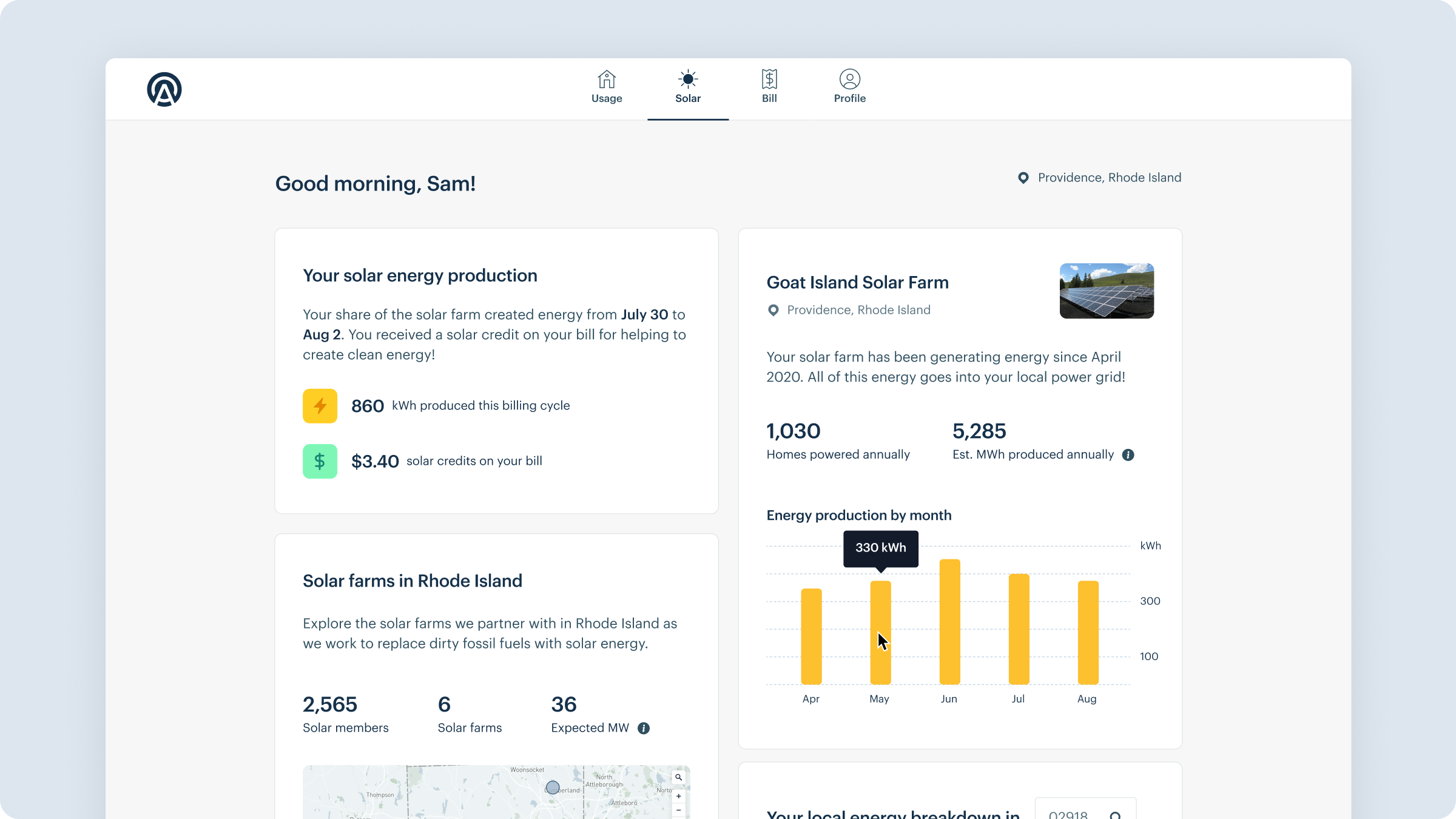
Overview of solar page once enrolled
I led a cross-functional brainstorming session to gather ideas across product, engineering, marketing, and customer experience, and created a list of ideas to explore.
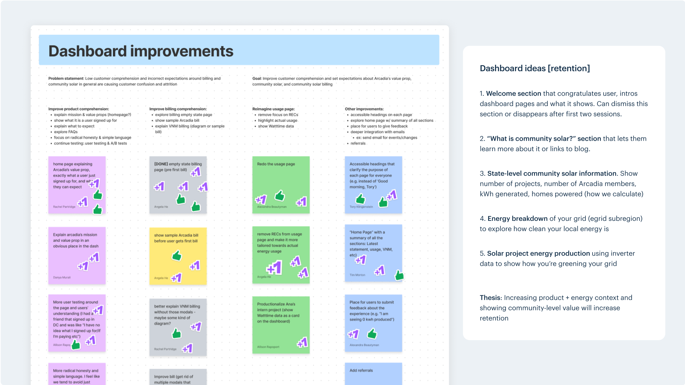
Brainstorming ideas
I mapped a user’s journey to being enrolled on a live solar farm, which helped prioritize the information we could show at each step. This also highlighted the need to show updates pre-enrollment as well as impact post-enrollment. Prior to being enrolled, we could also show evergreen content around the community impact they were making.
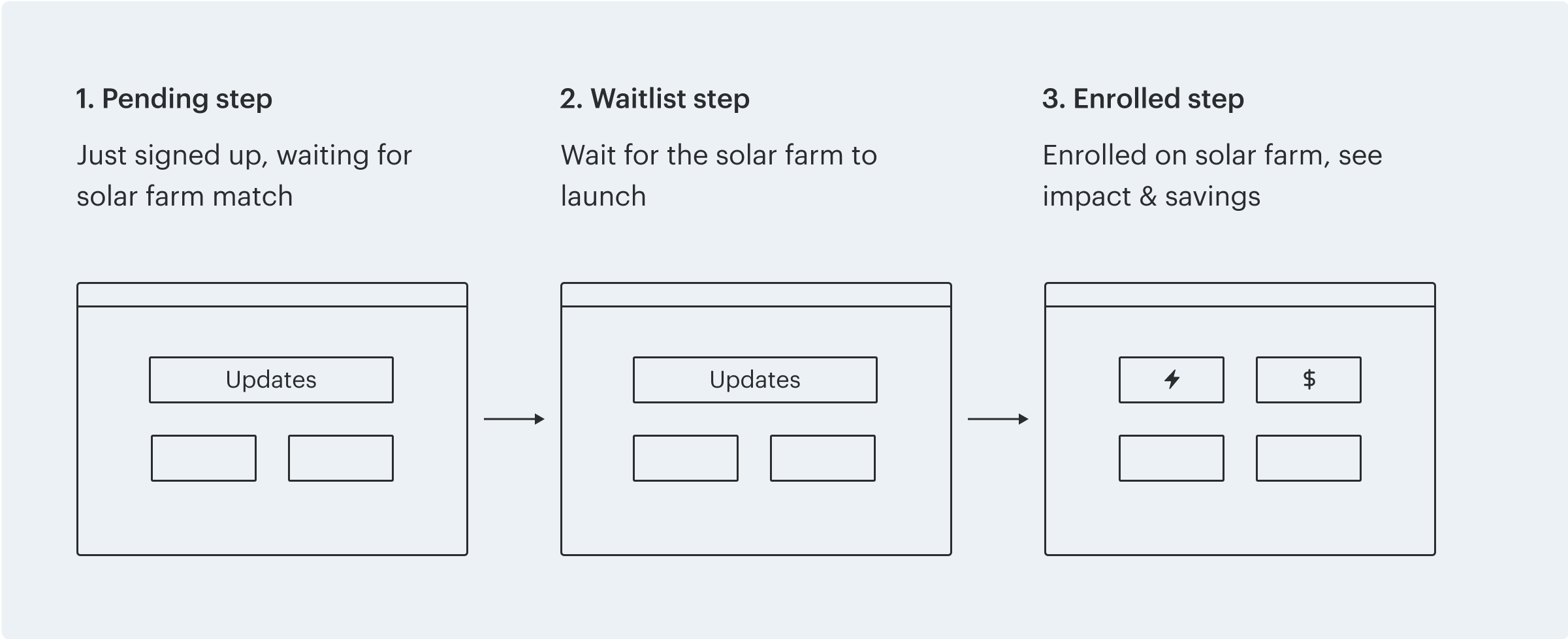
The three steps to joining a farm
I broke down the sections to design based on the steps of the enrollment journey. First, I explored Welcome and Explainer sections for the initial Pending step. There were technical constraints around having an onboarding tour, so I pushed for a design that communicated a user's status and linked out to an in-depth explainer blog.
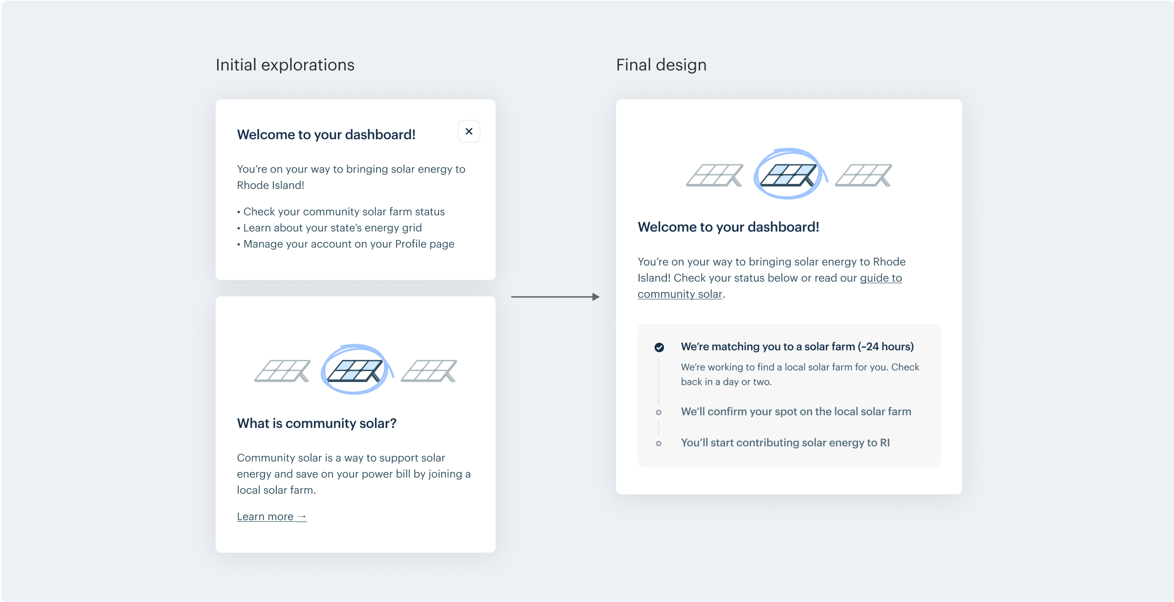
Welcome and Explainer section iterations
From there, I designed evergreen modules that we could show to customers before their solar farm was live. We landed on an interactive map of your state’s solar farms to demonstrate the community of Arcadia solar members. We also knew customers rarely thought about where their energy was coming from every time they turned on their lights, so I designed an energy breakdown vizualization for people to explore how clean or dirty their zip code’s energy is.
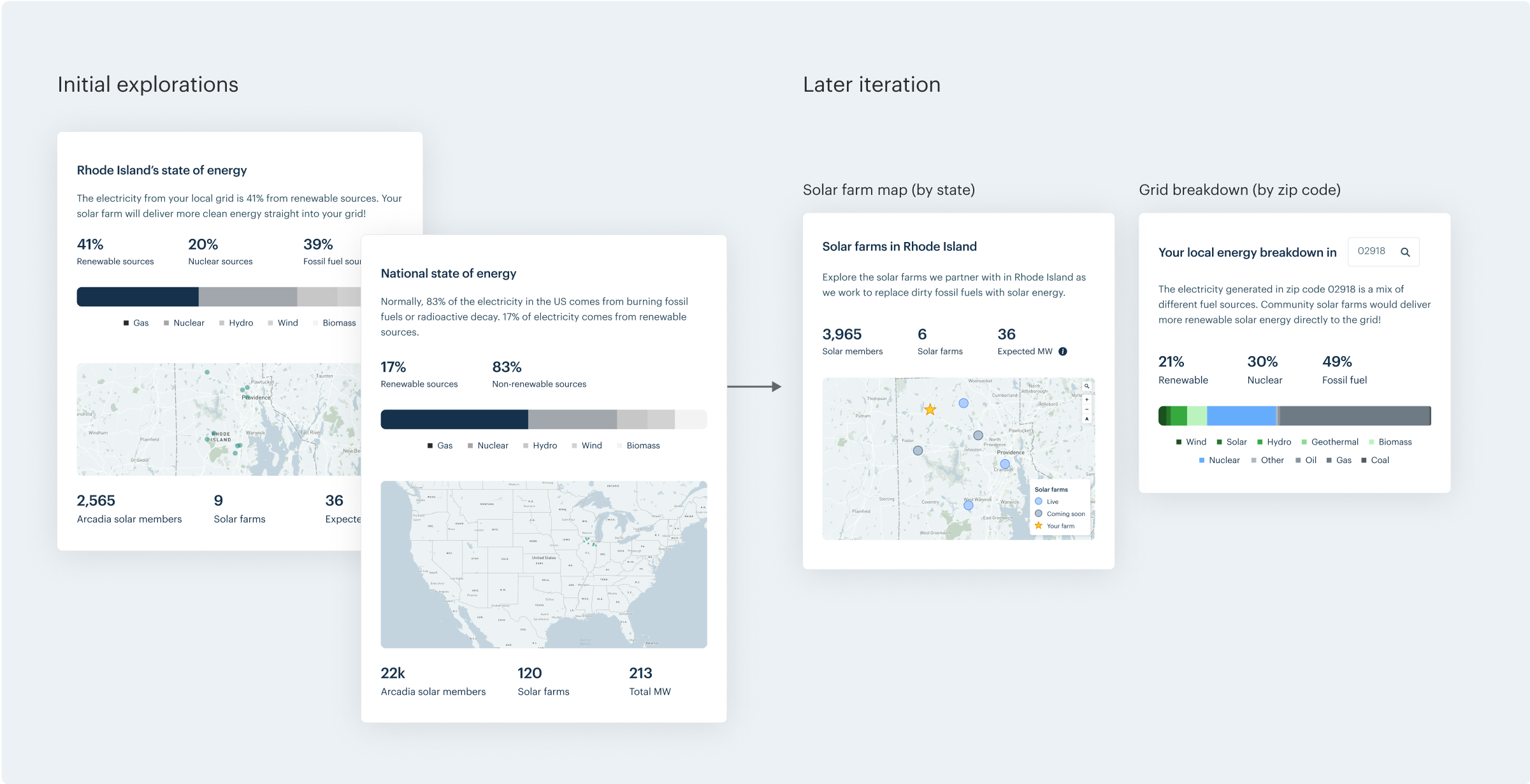
Solar farm map and energy breakdown iterations
We had real-time solar data once a farm launched, so I created a graph visualization of solar energy produced. An edge case was brought to my attention around empty graphs in initial time intervals, so I paired with an engineer to design various time interval variations based on how long the farm had been turned on for.
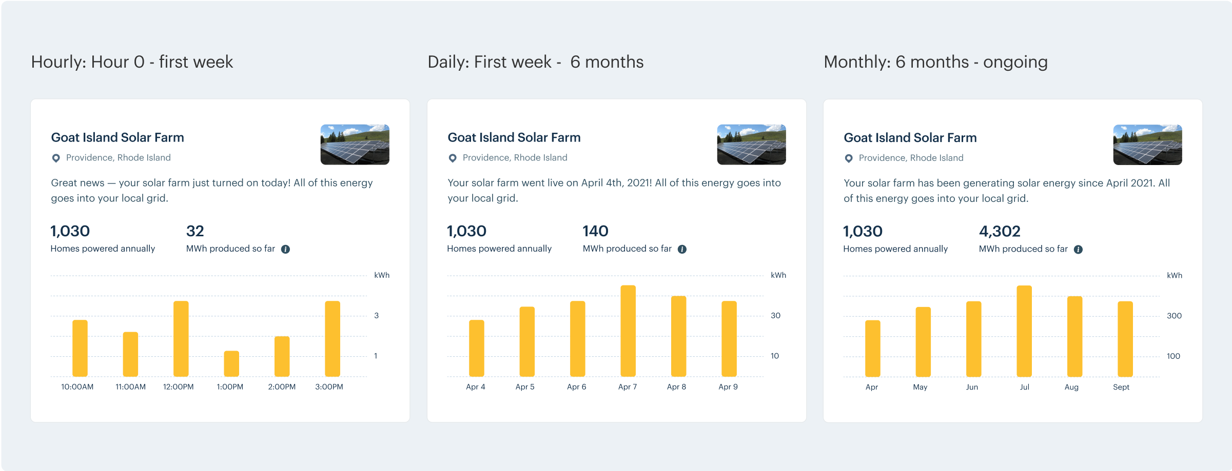
Solar energy production chart iterations
I drafted a research brief and conducted user tests with 8 people to understand how they interacted with these designs and to test comprehension of community solar. A few learnings were:
Overall, the designs increased comprehension around the enrollment waiting period for joining a community solar project, and we addressed the points of confusion through clarifying the pending step with wait time and an empty state of their savings.
User testing brief and script
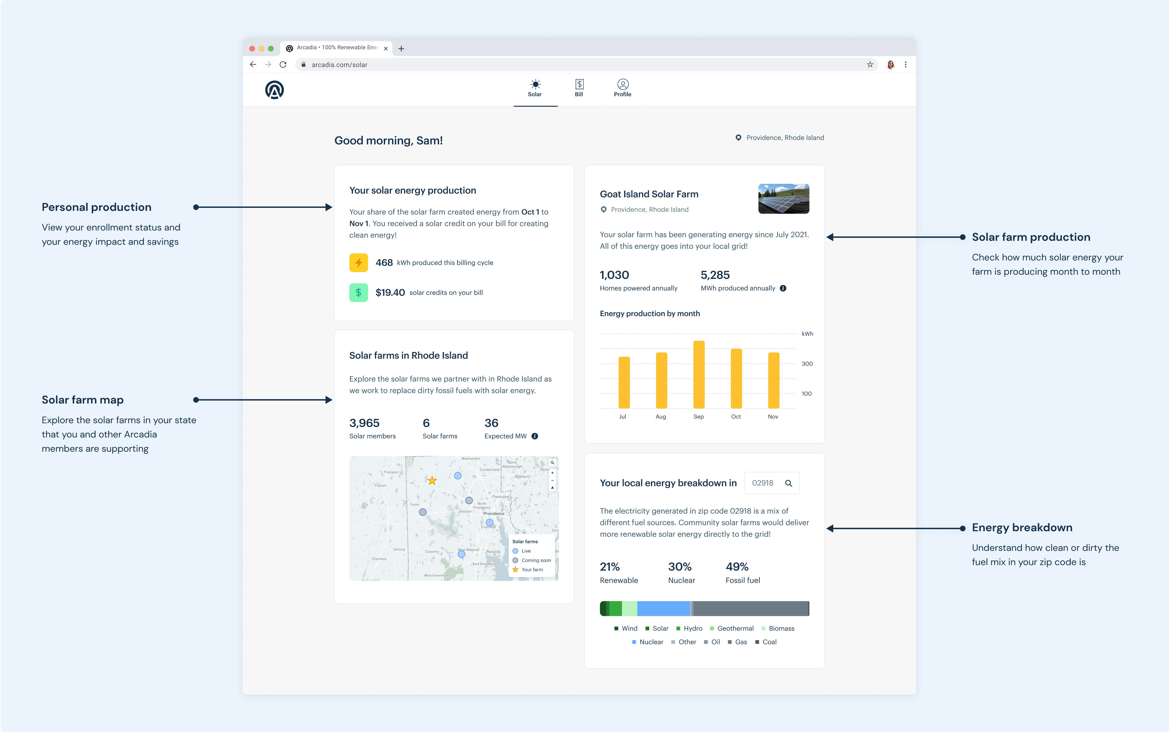
I provided our engineering team with a spec for web and mobile designs, and I partnered with them to ensure the final outcome was polished.
Preview of final design specs
The designs were built and released iteratively, and these improvements helped reduce customer attrition and cut down the number of customer service calls regarding pre-enrollment confusion.
Looking back, I would have loved to have designed more for the end-to-end experience, with improvements made across the website, sign-up, and emails, but we were limited by those cross-functional teams’ capacities.
Overall, this was an investment in making the dashboard oriented around our community solar product, which would pave the path to support iterative features in the future, such as our advocacy tool.